Best Ways to reduce your Shopping Cart Abandonment Rate
Table of contents
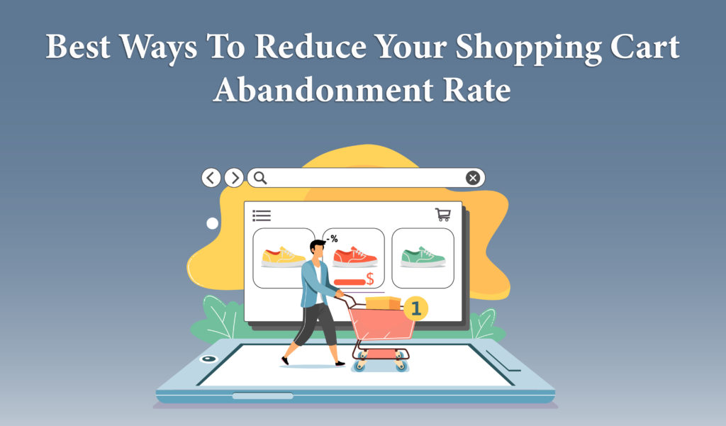
According to some estimates, up to 70% of online customers who add products to their shopping carts abandon the website before finishing their purchases.
This is a sobering figure for anyone in the e-commerce industry. But, even worse, abandoned carts have even more negative consequences for online retailers. Cart abandonment, for example, skews statistics and lowers conversion rates. It also raises the expense of acquiring new customers.
That’s why it’s important to consider what leads consumers to abandon their shopping carts, as well as what measures you can take to address the issue.
In this blog, Web Design Jacksonville experts have enlisted the ways that can help you reduce your cart abandonment rate. Have a look.
1. Create and maintain a sense of trust in your transaction forms.
Some online merchants regard transaction forms as only a formality in the sales process; after all, they’ve already enticed you with their goods, so why wouldn’t you fill out a lengthy form without hesitation? This is not the case, and your transaction forms are just as important as any other component of the process in creating and developing confidence in your website.
Keep in mind that when you ask your consumers to fill out a transaction form, you’re effectively asking them to trust you with their personal information. You’re asking for more than just their contact information; you’re also asking for their credit card information, which many people are naturally afraid to give up.
To alleviate their apprehension about handing up their hard-earned cash – and their financial identity – utilize your transaction forms to cultivate and establish trust. Place trust signals such as security logos near your transaction forms in a conspicuous location.
Make sure the logos are recognized and well-known. According to Shopify’s data, over 61 percent of customers have avoided making an online purchase because trust logos are missing, while more than 75 percent of consumers have avoided making a purchase because they don’t identify the trust logos.
2. On Checkout Pages, Include a Progress Indicator
Using a progress bar on your checkout page is one of the greatest ways to achieve this. It informs visitors that they’re almost done and that they’ll soon be free to return to looking at cat gifs online or doing whatever else. Customers prefer having a clear indicator of their progress in the process of completing a task.
3. Throughout the purchasing process, include thumbnail images of products.
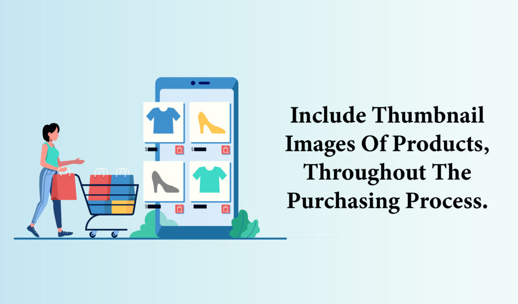
Most people won’t forget what’s in their shopping cart (unless they’re on a shopping binge) but using thumbnail photos of the things they’ve added to their basket as a progress indication may be another “grounding” strategy that reassures the consumer of what they’re buying.
When you shop in a physical store, you can see what you’re buying right in front of your eyes. In an e-commerce environment, this may not always be the case. By providing thumbnail photographs of things in the client’s basket, you’re not only assisting them in remembering what they’re doing – but you’re also removing the risk of distraction, notably the hesitancy a customer could have if they can’t recall what they’re buying right away.
This is far less daunting than a multi-page checkout procedure, and the buyer can see precisely what they’re purchasing during the entire process. Another advantage of thumbnails is that they retain the real items in the prospect’s mind, increasing the urge to acquire them that led them to start the checkout process in the first place.
The goal of any e-commerce checkout experience optimization is to reduce friction and make it as simple and comfortable as possible for customers to purchase items. Including thumbnails of purchases in customers’ carts helps to anchor the visitor throughout the process and considerably decreases the danger of them abandoning their cart in a moment of doubt or concern.
4. Make it simple to navigate between the cart and the store.
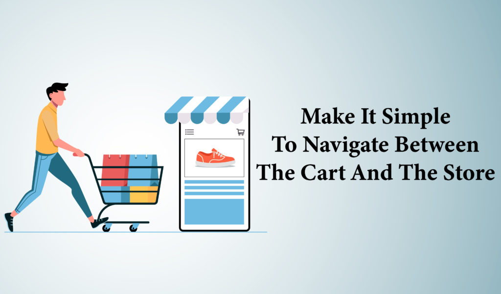
Consumers seldom make a purchase, identify and pick it effectively and promptly, and check out in a single streamlined experience. Purchasing online, like shopping in a physical store, may be indirect, inefficient, and non-linear. Customers are more likely to remain with their cart and check out if you make it easy for them to navigate between it and your store.
While navigating between a shopping cart and an e-commerce store is one of the most efficient methods to reduce friction during the checkout process, it’s also one of the most difficult to master. Even the largest e-commerce merchants, such as Amazon, are continuously experimenting with checkout flow in order to fine-tune the checkout experience and make it simpler for customers to purchase more items.
Many of the same web navigation rules that apply to the rest of your site apply to your checkout pages as well. When it comes to your checkout process, the classic web design cliché “the Back button doesn’t exist” is especially true. You should reconsider your navigational flow if you compel your visitor to click “Back” (or commit other sins against online navigation).
Allow consumers to store – and subsequently return to – their shopping carts in progress, as well as assist them in navigating your site by providing logical, easy navigation alternatives between your checkout and product pages. A good Website Design Company can help you do so.
5. Provide a variety of payment options
You don’t want anything – anything – to stand in the way of your consumers having a pleasurable, rewarding, and ultimately smooth buying experience when creating your e-commerce checkout pages. However, if you only provide one (or a few) payment options, you’re putting unneeded barriers in the way of your prospects and sales. Although credit card payment options are obvious, customers now have more alternatives than ever before for paying for things online.
Offering multiple payment alternatives reduces – or removes – another possible cause for a client to exit their basket and go elsewhere. However, make sure you are giving your consumers what they want, and that’s what matters.
6. On checkout pages, provide a strong call to action.
Many websites usually don’t add any call-to-action. The “logic” behind this appears to be based on the notion that once a consumer has put anything to their cart, they no longer require any more incentives to purchase it — a fatal mistake in the marketer’s worldview. Checkout pages, on the other hand, are ideal for strong, unambiguous calls to action that bolster the prospect’s commitment to finish their purchase. While it’s critical to have powerful CTAs on your checkout pages, it’s also critical to make sure that the messaging of these CTAs matches that of others throughout your site and marketing materials. Keep in mind that you want to offer a consistent, smooth experience from discovery to purchase or else you will confuse the visitors.
Consider testing your CTAs against simpler, more active verbs to see if they can assist visitors to grasp exactly what they’re doing and what’s expected of them if they include unclear terms like “Continue.”
Maintain consistency in your message from your CTAs to your checkout process. Maintain a warm, connecting tone during the checkout process if you favor friendly, connective language in your marketing materials. Keep the pressure on throughout checkout if you’re using urgency or another incentive. Also, depending on where the prospect is in the process, use relevant and consistent CTAs, especially if you’re utilizing a progress indicator – don’t assume users understand where they are in the process ahead of time.
7. Make it simple to save carts
It should be as simple as clicking a single button to save a shopping cart. Most browsers allow users to save login credentials for sites like Amazon, minimizing the friction of multiple sign-ins and allowing users to temporarily abandon their carts. Don’t make your consumers uncomfortable by saving their data without their consent or knowledge.
8. Allow guests to check out in a variety of ways
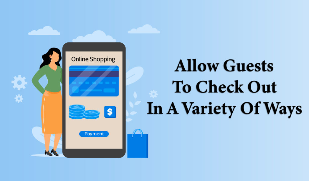
While you may view the checkout process as a good chance to acquire data about your consumers – and it can be – asking customers to create an account with your business can be a huge impediment to making a purchase.
According to Invesp’s research, one of the major causes of shopping cart abandonment is the lack of a guest checkout option. Approximately 14% of online buyers said that being forced to log in to finish a transaction was enough to make them abandon the process – a more major stumbling block than being asked for too much information or having an overly complicated checkout procedure.
You’ll have to give up some of the sweet, sweet data that marketers love if you provide a guest checkout option. You will, however, make life much simpler for your consumers, which is precisely what they want. You’ll earn more sales if you make it easy for folks to buy from you. Furthermore, if you provide a seamless online purchasing experience, you may discover that former customers are more eager to not only buy from you again in the future but also create accounts to take advantage of loyalty programs and other benefits.
9. Provide a no-questions-asked money-back guarantee (or Other Assurances)
Ecommerce retailers’ worst foes are hesitation and uncertainty. The more you can do to either anticipate potential concerns or reassure prospects on a regular basis, the higher your conversion rates will be. Offering watertight money-back guarantees or other promises is one of the finest strategies to overcome the hesitancy in the online shopping experience. Because of the nature of e-commerce, the transaction procedure requires a tremendous amount of trust. Users can only see photos of what they’re buying. They can’t touch it, feel it, or kick the tires; they can only go on what you tell them, and that’s before you include the “sending credit card information into the ether” aspect of the encounter. Sure, e-commerce has gone a long way since Amazon’s inception in 1994(!), but there is still a lot of skepticism and doubt among online merchants.
Offering a no-questions-asked money-back guarantee (or comparable assurance offer) considerably lowers any potential objections a prospect may have to purchase from you. It transfers the emphasis away from the price and terms of sale and toward the product itself, which should presumably speak for itself. If a buyer is hesitant to buy from you, it should not be because they are afraid of losing money. Do everything you can to make clients feel more confident about purchasing from you. Be as aggressive in your dedication to taking care of your consumers. Even if you already have a great returns policy, don’t bury it in the fine print of your terms and conditions page; instead, place it front and center somewhere in your checkout process.
Up to 70% of online customers who add products to their shopping carts abandon the website before finishing their purchases. Some online merchants regard transaction forms as only a formality in the sales process. But they are just as important as any other component in creating and developing confidence in your website. Using thumbnail photos of items in a customer’s shopping cart to help them stay focused on their purchase may be another “grounding” strategy that reassures the consumer. The goal of any e-commerce checkout experience optimization is to reduce friction and make it as simple and comfortable as possible for customers to purchase items.
Purchasing online may be indirect, inefficient, and non-linear. Customers are more likely to remain with their cart and check out if you make it easy for them to navigate between it and your store. Even the largest e-commerce merchants are continuously kept experimenting with checkout flow.
Also, make sure to maintain consistency in your message from your CTAs to your checkout process. Make it simple to save carts – it should be as simple as clicking a single button to save a shopping cart. 14% of online shoppers abandon their shopping carts without a guest checkout option. Offering watertight money-back guarantees or other assurances will help boost conversion rates.
Former customers will be more eager to buy from you again if you provide a seamless online purchasing experience. There is still a lot of skepticism and doubt among online merchants. Offering a no-questions-asked money-back guarantee considerably lowers any potential objections. We hope this article might have been very helpful for you. You can also refer to our blog – elements present in a good e-commerce website for more help.